
A note from our founder
For all of our supporters - past, present and future - I think it may be timely for me to explain why we are now engaged in a re-branding of the charity.
 We are originally a British charity, but since our establishment in 2000, we have become increasingly involved in the issues that are shaping Burma/Myanmar. Because of this, it may be apt for me to begin with something deeply rooted in Eastern culture...
“All life is change” is a well-known Buddhist tenet, and this is something that we are closely aware of as a charity who serve a variety of communities in continually shifting circumstances. Our organisation has had to respond to a number of changes over the years as the scope of our work has grown, and the nature of our work has developed accordingly.
Karen Education Partnership
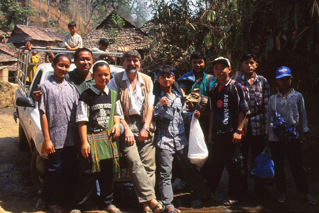
The organisation was originally set up as the "Karen Education Partnership" by volunteer British teachers. Contact had been made with the Karen by myself in 1996, but at the request of the Karen in 2000, we were able to send a small group of 4 teachers to deliver a short summer school in Mae Ra Ma Luang refugee camp. Shortly after that, we formally established the "Karen Education Partnership". For the next 7 years, we sent self-funding teams of British teachers to the Karen camps to deliver "summer schools" once a year.
Burma Education Partnership
In 2007, the situation changed as we began to attract funding and were able to work with a range of ethnic groups in both the refugee and migrant communities. We thought it appropriate to change our name to "Burma Education Partnership" to include all ethnicities, and to amend the logo accordingly. For our new logo, we combined the Burmese mythical lion, the chinthe, with the Eastern symbol of wisdom, the lotus.
In the years to follow, the charity began to develop a particular model of teacher training based around the use of mobile units of trainers who work with local teachers in the scattered refugee and migrant schools, at the classroom-level. The two elements of mobility and partnership began to define the way the charity worked and established its particular identity.
Mobile Education Partnerships
In 2016, we began to work inside Burma/Myanmar, and it became increasingly evident that our name and logo contained controversial elements. "Burma" had become "Myanmar", and the chinthe was the symbol associated with a major political party. In order to avoid possible controversy, we decided to re-brand the charity but still maintain a sense of continuity.
The decision was made to rename the charity "Mobile Education Partnerships". This was a clear statement of what we do and how we do it. The word mobile speaks of our portable model that can be used anywhere where there are scattered schools.
![]() The choice of the new logo for Mobile Education Partnerships was based on three requirements. We wanted something that had a blend of East and West, reflecting the make-up of the charity; we wanted a combination of symbols of wisdom and mobility; and we wanted a sense of continuity from Burma Education Partnership.
The choice of the new logo for Mobile Education Partnerships was based on three requirements. We wanted something that had a blend of East and West, reflecting the make-up of the charity; we wanted a combination of symbols of wisdom and mobility; and we wanted a sense of continuity from Burma Education Partnership.
With this in mind, we introduced the Pegasus figure as a classical Western symbol of wisdom, creativity and inspiration. Pegasus also added a sense of mobility and energy. The lotus was kept as the Eastern symbol of knowledge and enlightenment, with the red lotus as the symbol of compassion and love.
What does remain unchanged is our commitment to work with the people of Burma/Myanmar as we have done for the last twenty years. We will continue to support teachers, and will strive for effective education systems to support the students of the future.
We hope that we can continue to rely on your vital support.
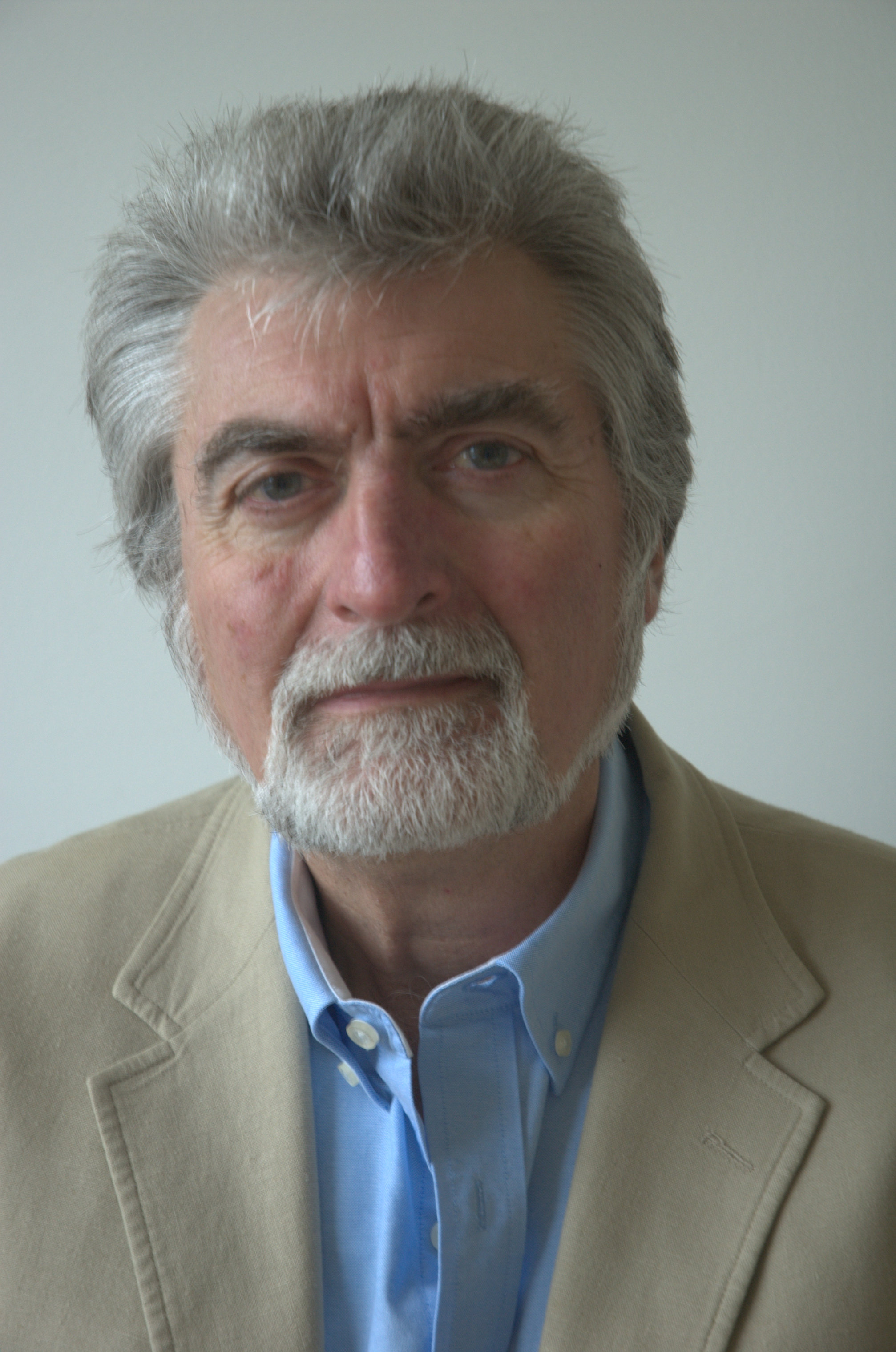
Bob Anderson
BACK